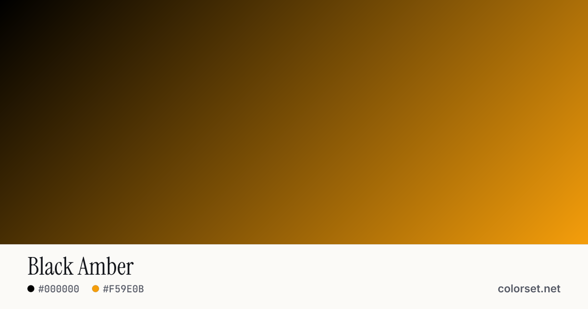
Black Amber
Customize and copy the CSS
Code
background: #000000;
background: linear-gradient(135deg, #000000 0%, #F59E0B 100%);
Color stops
| Stop | Position | HEX | RGB | HSL | OKLCH |
|---|---|---|---|---|---|
| Stop 1 | 0% | ||||
| Stop 2 | 100% |
Save image
Similar gradients
About Black Amber
Black Amber is a warm orange gradient that runs from #000000 to #F59E0B. By default it flows top-left to bottom-right at 135°, and its midpoint blends to #5F3A01.
The first color is very dark (0% lightness) and the second one is light (77%), with an average look that is softly saturated. The colors stay within a 1° slice of the color wheel, so the blend reads as one hue changing in lightness rather than a shift between colors.
It suits friendly call-to-action buttons and playful hero sections. Lightness changes a lot along this gradient (77% range), so no single text color holds up everywhere. Put text on a solid card or only over the stronger end.
Dark gradients like this one sit comfortably behind light text and cards. A radial shape turns it into a soft glow, and the reverse button swaps which end is darker.