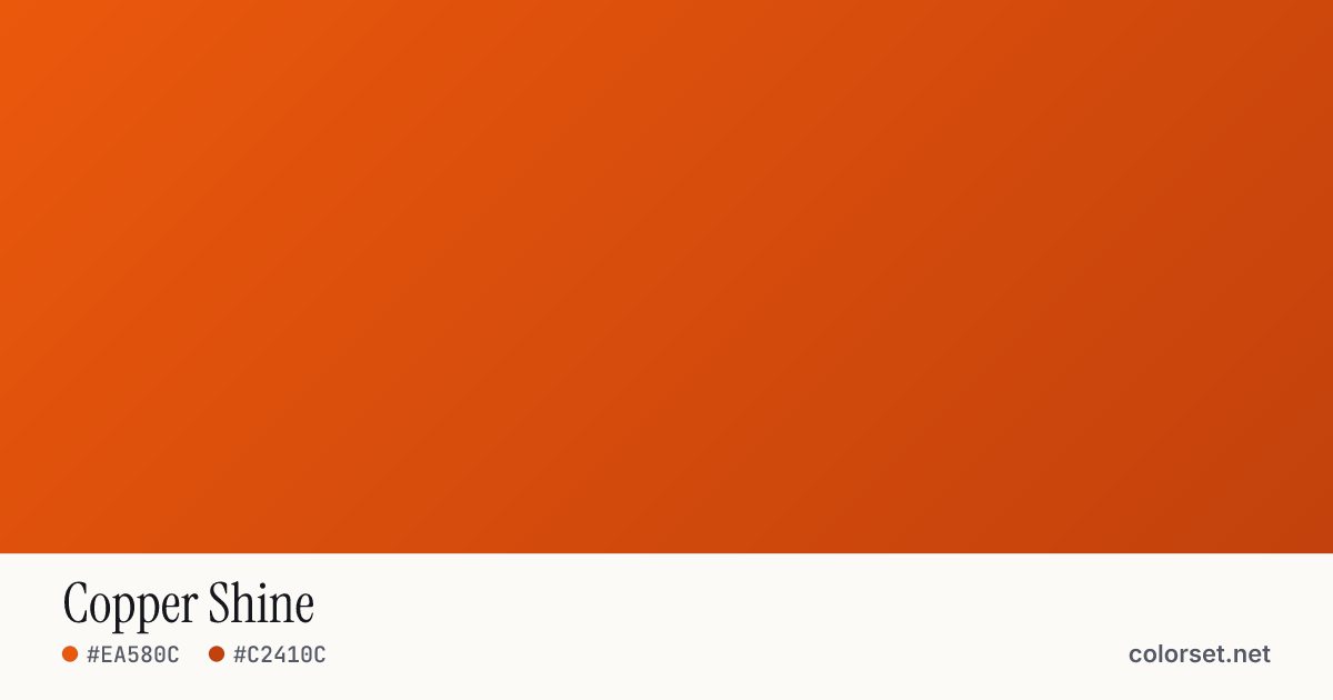
Copper Shine
Customize and copy the CSS
Code
background: #EA580C;
background: linear-gradient(135deg, #EA580C 0%, #C2410C 100%);
Color stops
| Stop | Position | HEX | RGB | HSL | OKLCH |
|---|---|---|---|---|---|
| Stop 1 | 0% | ||||
| Stop 2 | 100% |
Save image
Similar gradients
About Copper Shine
Copper Shine blends two colors, starting at #EA580C and ending at #C2410C. By default it flows top-left to bottom-right at 135°, and its midpoint blends to #D64C0D.
Both colors are mid-tone (65% and 55% lightness), with an average look that is vivid. The colors stay within a 3° slice of the color wheel, so the blend reads as one hue changing in lightness rather than a shift between colors.
It suits friendly call-to-action buttons and playful hero sections. Black text keeps at least 4.0:1 contrast across every stop, enough for large headings (WCAG AA large text) but not for small body copy.
Colors this close blend cleanly without any extra settings. Rotate the angle, reverse the direction, or switch to a radial or conic shape to adapt it to your layout.