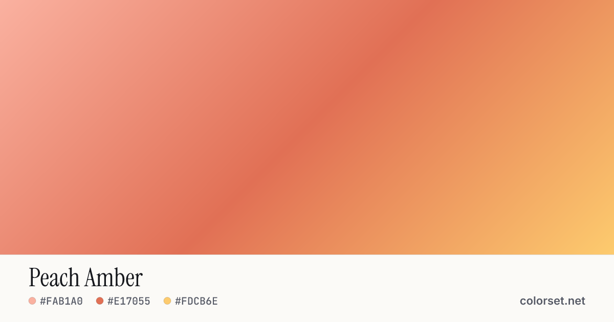
Peach Amber
Customize and copy the CSS
Code
background: #FAB1A0;
background: linear-gradient(135deg, #FAB1A0 0%, #E17055 50%, #FDCB6E 100%);
Color stops
| Stop | Position | HEX | RGB | HSL | OKLCH |
|---|---|---|---|---|---|
| Stop 1 | 0% | ||||
| Stop 2 | 50% | ||||
| Stop 3 | 100% |
Save image
Image size
Similar gradients
About Peach Amber
Peach Amber is a warm multi-color gradient that runs from #FAB1A0 to #FDCB6E. By default it flows top-left to bottom-right at 135°, and #E17055 sits near the middle.
The opening color is light (83% lightness) and the closing one is light (87%), with an average look that is vivid. The hue travels about 48° around the color wheel, a gentle shift that stays easy on the eye.
It suits sale banners, alerts and bold call-to-action buttons. Black text keeps at least 6.6:1 contrast across every stop, which passes WCAG AA for body text.
Because the colors are close on the color wheel, the blend looks smooth in either color space. Try other angles, or a radial or conic shape, to see how it fits different layouts.