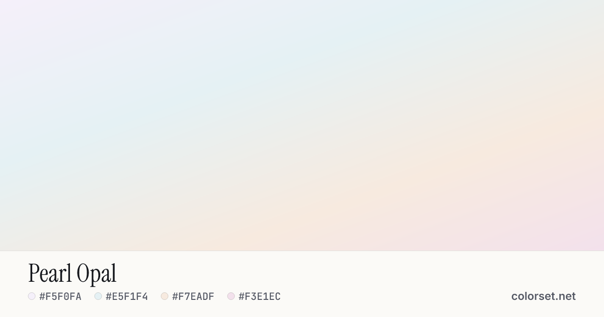
Pearl Opal
Customize and copy the CSS
Code
background: #F5F0FA;
background: linear-gradient(160deg, #F5F0FA 0%, #E5F1F4 35%, #F7EADF 70%, #F3E1EC 100%);
Color stops
| Stop | Position | HEX | RGB | HSL | OKLCH |
|---|---|---|---|---|---|
| Stop 1 | 0% | ||||
| Stop 2 | 35% | ||||
| Stop 3 | 70% | ||||
| Stop 4 | 100% |
Save image
Image size
Similar gradients
About Pearl Opal
Starting from #F5F0FA and finishing on #F3E1EC, Pearl Opal is a balanced neutral gradient. By default it flows roughly top to bottom at 160°, and #F7EADF sits near the middle.
The opening color is very light (96% lightness) and the closing one is very light (93%), with an average look that is nearly neutral. These are near-neutral tones, so the blend reads as a change in lightness rather than a change in color.
It suits quiet backgrounds, cards and dark-mode surfaces. Black text keeps at least 16.7:1 contrast across every stop, which passes WCAG AA for body text.
The two ends are close enough that sRGB and OKLCH interpolation look nearly the same. Change the angle or switch to a radial or conic shape to see how it behaves in other layouts.