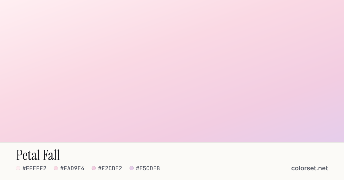
Petal Fall
Customize and copy the CSS
Code
background: #FFEFF2;
background: linear-gradient(160deg, #FFEFF2 0%, #FAD9E4 40%, #F2CDE2 75%, #E5CDEB 100%);
Color stops
| Stop | Position | HEX | RGB | HSL | OKLCH |
|---|---|---|---|---|---|
| Stop 1 | 0% | ||||
| Stop 2 | 40% | ||||
| Stop 3 | 75% | ||||
| Stop 4 | 100% |
Save image
Image size
Similar gradients
About Petal Fall
Petal Fall blends 4 colors, starting at #FFEFF2 and ending at #E5CDEB. By default it flows roughly top to bottom at 160°, and #F2CDE2 sits near the middle.
The opening color is very light (97% lightness) and the closing one is light (88%), with an average look that is muted. The hue travels about 36° around the color wheel, a gentle shift that stays easy on the eye.
It suits soft call-to-action buttons and playful cards. Black text keeps at least 14.2:1 contrast across every stop, which passes WCAG AA for body text.
Colors this close blend cleanly without any extra settings. Rotate the angle, reverse the direction, or switch to a radial or conic shape to adapt it to your layout.