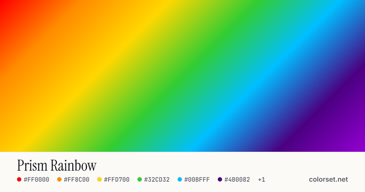
Prism Rainbow
Customize and copy the CSS
Code
background: #FF0000;
background: linear-gradient(135deg, #FF0000 0%, #FF8C00 16%, #FFD700 33%, #32CD32 50%, #00BFFF 66%, #4B0082 83%, #9400D3 100%);
Color stops
| Stop | Position | HEX | RGB | HSL | OKLCH |
|---|---|---|---|---|---|
| Stop 1 | 0% | ||||
| Stop 2 | 16% | ||||
| Stop 3 | 33% | ||||
| Stop 4 | 50% | ||||
| Stop 5 | 66% | ||||
| Stop 6 | 83% | ||||
| Stop 7 | 100% |
Save image
Similar gradients
About Prism Rainbow
Starting from #FF0000 and finishing on #9400D3, Prism Rainbow is a balanced multi-color gradient. By default it flows top-left to bottom-right at 135°, and #32CD32 sits near the middle.
The opening color is mid-tone (63% lightness) and the closing one is deep (51%), with an average look that is highly saturated. The hue swings roughly 173° across the color wheel, which gives the gradient a wide, multi-tone sweep.
It suits premium-feeling hero sections and AI-product branding. Lightness changes a lot along this gradient (55% range), so no single text color holds up everywhere. Put text on a solid card or only over the stronger end.
Because the hue changes a lot, blending in the sRGB color space can turn the middle gray or muddy. Switch on OKLCH interpolation above to keep the transition clean, then copy the CSS with the "in oklch" hint.