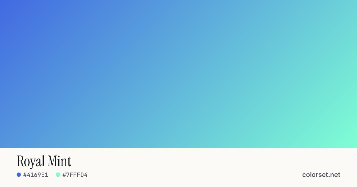
Royal Mint
Customize and copy the CSS
Code
background: #4169E1;
background: linear-gradient(135deg, #4169E1 0%, #7FFFD4 100%);
Color stops
| Stop | Position | HEX | RGB | HSL | OKLCH |
|---|---|---|---|---|---|
| Stop 1 | 0% | ||||
| Stop 2 | 100% |
Save image
Similar gradients
About Royal Mint
Starting from #4169E1 and finishing on #7FFFD4, Royal Mint is a cool multi-color gradient. By default it flows top-left to bottom-right at 135°, and its midpoint blends to #00BDE1.
The first color is mid-tone (56% lightness) and the second one is very light (91%), with an average look that is vivid. The hue swings roughly 97° across the color wheel, which gives the gradient a wide, multi-tone sweep.
It suits tech products, onboarding screens and navigation bars. Black text keeps at least 4.3:1 contrast across every stop, enough for large headings (WCAG AA large text) but not for small body copy.
Because the hue changes a lot, blending in the sRGB color space can turn the middle gray or muddy. Switch on OKLCH interpolation above to keep the transition clean, then copy the CSS with the "in oklch" hint.