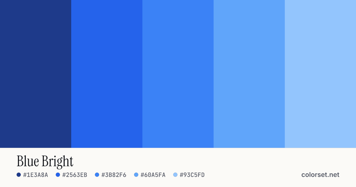
PreviewingGo to this paletteOpen in generator
Code
/* Blue Bright — colorset.net */
:root {
  --color-1: #1E3A8A;
  --color-2: #2563EB;
  --color-3: #3B82F6;
  --color-4: #60A5FA;
  --color-5: #93C5FD;

  --color-bg: #F1F8FF;
  --color-surface: #E4EFFB;
  --color-border: #C9D6E5;
  --color-text: #2B3F72;
  --color-muted: #616C83;
  --color-primary: #2563EB;
  --color-on-primary: #FFFFFF;
  --color-accent: #5C8CC1;
  --color-on-accent: #000000;
}

@media (prefers-color-scheme: dark) {
  :root {
    --color-bg: #080F1F;
    --color-surface: #12192A;
    --color-border: #242D42;
    --color-text: #AAC3E1;
    --color-muted: #72859B;
    --color-primary: #2563EB;
    --color-on-primary: #FFFFFF;
    --color-accent: #60A5FA;
    --color-on-accent: #080F1F;
  }
}
Color values
| Color | HEX | RGB | HSL | OKLCH |
|---|---|---|---|---|
| 1 | ||||
| 2 | ||||
| 3 | ||||
| 4 | ||||
| 5 |
Roles & contrast
Original colors are kept; roles are adjusted only when needed for contrast.
| Role | Light mode | Dark mode |
|---|---|---|
| Background | adjusted for contrast · from #93C5FD | adjusted for contrast · from #1E3A8A |
| Surface | derived | derived |
| Border | derived | derived |
| Text | adjusted for contrast · from #1E3A8A | adjusted for contrast · from #93C5FD |
| Muted text | derived | derived |
| Primary | from palette · color 2 | from palette · color 2 |
| On primary | derived | derived |
| Accent | adjusted for contrast · from #3B82F6 | from palette · color 4 |
| On accent | derived | derived |
Contrast
| Pair | Sample | Ratio | WCAG |
|---|---|---|---|
| Text on background | 9.54:1 | AAA pass 4.5:1 | |
| Text on surface | 8.77:1 | AAA pass 4.5:1 | |
| Muted text on background | 4.93:1 | AA pass 4.5:1 | |
| Label on primary | 5.17:1 | AA pass 4.5:1 | |
| Label on accent | 5.98:1 | AA pass 4.5:1 | |
| Primary on background | 4.83:1 | AA pass 3:1 | |
| Accent on background | 3.28:1 | AA Large pass 3:1 |
| Pair | Sample | Ratio | WCAG |
|---|---|---|---|
| Text on background | 10.56:1 | AAA pass 4.5:1 | |
| Text on surface | 9.68:1 | AAA pass 4.5:1 | |
| Muted text on background | 5.05:1 | AA pass 4.5:1 | |
| Label on primary | 5.17:1 | AA pass 4.5:1 | |
| Label on accent | 7.52:1 | AAA pass 4.5:1 | |
| Primary on background | 3.70:1 | AA Large pass 3:1 | |
| Accent on background | 7.52:1 | AAA pass 3:1 |
Every color on every color
Rows are backgrounds and columns are text colors, using the actual palette colors. Ratios: AAA 7:1, AA 4.5:1, AA large text 3:1.
| Background / Text | #1E3A8A (Text 1) | #2563EB (Text 2) | #3B82F6 (Text 3) | #60A5FA (Text 4) | #93C5FD (Text 5) |
|---|---|---|---|---|---|
| #1E3A8A | Same color | 2.00— | 2.82— | 4.07AA Large | 5.74AA |
| #2563EB | 2.00— | Same color | 1.41— | 2.03— | 2.87— |
| #3B82F6 | 2.82— | 1.41— | Same color | 1.45— | 2.04— |
| #60A5FA | 4.07AA Large | 2.03— | 1.45— | Same color | 1.41— |
| #93C5FD | 5.74AA | 2.87— | 2.04— | 1.41— | Same color |
Shades
Shades and tints (50–950)
#1E3A8A#2563EB#3B82F6#60A5FA#93C5FD